Best UI Design Tips for Marketplace App like Uber & Airbnb
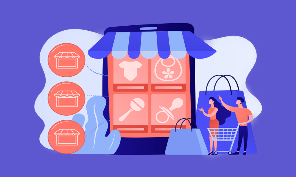
Table of Contents
Mobile app development has become the most powerful and versatile technology. Developing a custom mobile app empowers any business to gain easy access and a proven platform to reach consumers effectively, anywhere, anytime. Speaking about the target customers, two things resurface instantly the moment we talk about developing an app.
UI (User Interface) and UX (User Experience) are these two unmissable things to consider in the process of mobile app development.
Importance of user interface design in mobile applications
Any entrepreneur must understand the importance of UI/UX Design services because failure to focus on UI design can affect your app’s credibility. Nice user interfaces coupled with a good user experience are key to making your applications successful. It is imperative to understand the behavior of your target market before going for any mobile app development project. The user interface affects the user experience. Let us talk about a marketplace concept and the things which are essential while designing UI to make it a successful app.
There are three essential components to cover while designing a marketplace app which is mentioned below. Let us understand that what things are there to be considered while designing UI for all the three areas to cover.
- A catalog/list of products or services
- Search and Filter options
- Checkout
A Catalog/List of Products or Services
The first question that comes to mind for this is how the user is going to browse the product list or catalog? Here are some tricks.
1) Simplify the Menu/List
If there are too many options of choices provided in the list, then the user may get confused and it will only increase time for the user to make a decision. Users will not feel overwhelmed if they find too many options to start with. It is wise to organize all the elements on the basis of visual hierarchy which says that by using color, contrast, texture, shape, position, and size, you can organize elements on a page so that users identify which object is the most important. Let us see Uber as an example to understand this.
2) Uber’s Simple UI Design
Uber’s initial feature was simple- Push a button and get a ride. When the features were added to define a flow, it got more complex. They realized that people were selecting the wrong products ((Uber Pool)) when they had to catch a movie and opportunities to save time by suggesting good pickup spots were being missed. Now instead of getting the ride to the people, they now ask “Where to?”.
By knowing the destination, they now give you opportunities to make better decisions with upfront fares and the products in order to provide a much clear and fair choice to reach the destination. It now searches for the fastest pickup point while you are selecting a product. Once the request is made, the app will allow you to have a peek into your future by showing you the drivers you could be paired up with to give you an estimated time sooner.
3) Search/ Filter Options
There are many search/ filter patterns that can be used to come up with a final UI design. It depends on the range of services and products along with vendors too. Probably the most useful search pattern is auto-complete where typing will give you search results.
4) Airbnb’s Simplified UI design for Search/ Filter option
Airbnb came up with a simple filter and search option on its dashboard itself so that you can enter your requirements and navigate the results with a single tap. Just enter the location and the best results will be on your screen the next moment will all the details about the product and services you wish for. The app suggests the places to go for according to the location you entered to enhance the user experience. It will show the pictures of the property you want to hire with every bit of detail about the facilities it possesses. Just imagine how much time it saves while giving the best experience to the users.
Uber app has not been into the search and filter criteria that stop users from getting confused. The app will only pop up the ride options which are available upon entering the destination. You select the ride and off you go. The app uses a location that allows you to track the arrival of the driver. That is really engaging and appealing from a user’s point of view. From the vendor’s point of view, the driver will be able to track your location to avoid any misunderstandings or physical searching.
5) Checkout/ Payment
All the marketplace business models do not need to have payment modules integrated. Even if you want to integrate the payment module, you have to provide the options in full so that users can select any of the payment choices given within the app. The payment process follows after the booking process and users can save their payment information for a quick and hassle-free checkout in the future.
Airbnb provides an option to pay by credit or debit cards or through net banking. Uber also gives you multiple options along with these options like apple pay, PayPal, and more.
Wrapping It Up
Looks of the UI design of an app depends on the market that you target. The bottom line is to find a way to create a User Interface that is easy to understand and user-friendly. With the mobile app development space which is continuing to grow, you need a unique and informative user interface to make your app stand out on the app store or play store.
The designers of IndiaNIC have the expertise and understanding of these principles of UI/UX design to make your mobile app development project a successful one. If you have any query or any idea that needs our technical help for developing a mobile app destined to become successful, get in touch right now.